Build a timeline visualization
You can use Kibana’s time series visualization to see an overview of how customers are interacting with your application.
First, spend some time in the Bookstore front end. Run some searches, add some items to the cart, and make multiple purchases.
(Note: there’s a bug in the UI, you can’t search again from the search results page. Instead, click the
 icon to return to the home page)
Click the visualization icon (
 ). If you are looking at a previous visualization, click the visualization icon again. Two clicks clears a current visualization.
Click the Plus icon to create a new visualization
Scroll down and click Visual Builder
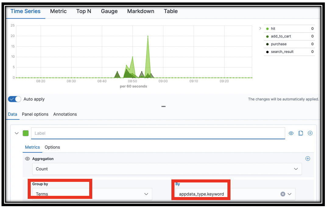
In the visual builder, select Terms from the Group By menu.
Select
appdata_type.keywordfrom the By menu.Click Save (top left) to save your visualization as KPI Time Series
The resulting visualization shows you a count of search_result documents (log lines), add_to_cart documents, purchase documents, and hits documents. This high level view tells you how your customers are interacting with your catalog.
[Optional] You can also filter the documents to remove, e.g. the hits from the graph. Select the Options tab in visual builder. In the Filter box, enter NOT appdata_type:hit. The chart updates to remove hits.
[Optional] Experiment with building time series visualizations for other fields. There is rich data in the segments-* index. Set the index pattern in the Panel options tab. Try visualizing aws_operation.keyword or http_response_status in the Data panel Group By selectors for example.