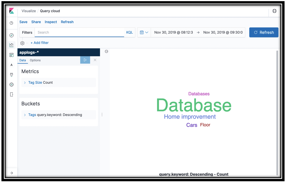
What are your customers searching for?
The Search function is logging the keywords from your customer queries. You can visualize these keywords with a vertical bar, or you can use a tag cloud to see them.
- Click the visualization icon, twice if you need to
- Click the Plus icon
- Select the applogs-* index pattern
- In the Buckets section, click Tags
- In the Aggregation menu, select Terms
- In the Field menu, select query.keyword
- Click the update icon to see a tag cloud of your customer queries
- Save the visualization as Query cloud
[Optional] What’s even more interesting is to see what’s missing from your catalog. In the Filters box, type hits_count:0. You might have to go back to the Bookstore Demo and search for something crazy like asdf to have data if you don’t already have some empty search results. This information can guide you on building out your eCommerce catalog, or figuring out which features are not working properly for your customers.
Work with line graphs
You use line graphs for tighter control over how you monitor values for your application’s KPIs. You graph the sum, average, max, or min of a numeric field on the Y-Axis and use the X-Axis to bucket by time. You narrow or expand the time window to control the data in the graph.
- In Kibana, click the visualization icon, twice if you need to
- Click the Plus icon on the top-right
- Click Line
- Choose applogs-* under Choose a source
When you work with time series data, first you set a date histogram for the X Axis, then you choose a numeric aggregation like Sum or Max of a field for the Y axis. To further decompose your data, you add sub buckets on the X axis.
Under Buckets, Click X-Axis
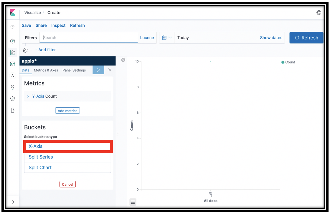
In the Aggregations menu, click Date Histogram
Click the
 icon
iconYou now have a count of the items in the applogs-* indexes on the Y-Axis.
Click the disclosure triangle next to Y-Axis
In the Aggregation menu, click Sum
In the Field menu, select the total_purchase field
This line graph gives you the total purchases across time, as captured by the <project name>-Checkout function. You can examine the
log_salemethod in the Lambda function to see the records it sends to Amazon ES.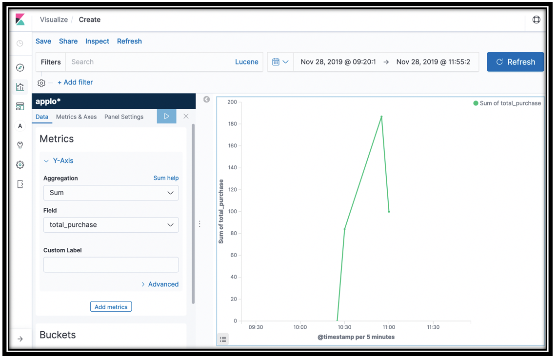
This is not actually quite right. Both addToCart and Checkout record a total_purchase field. Your visualization gathers data from both of these
appdata_types, since they’re in the same index. In order to see purchases from Checkout only, you need to add a Filter. In the Filter box, typeappdata_type:purchase.[Optional] Another alternative is to graph both
add_to_cartandpurchaseusing a Terms sub aggregation on theappdata_typefield. Or you can use a Filters sub aggregation to selectadd_to_cartorpurchaseexplicitly
You might wonder why we added a total purchase to the addToCart function. By viewing both adds and purchases, you can see what orders your customers are abandoning in their carts. You can further dig in to try to diagnose the cause to increase revenue.
- Click Save and save the visualization as total sales
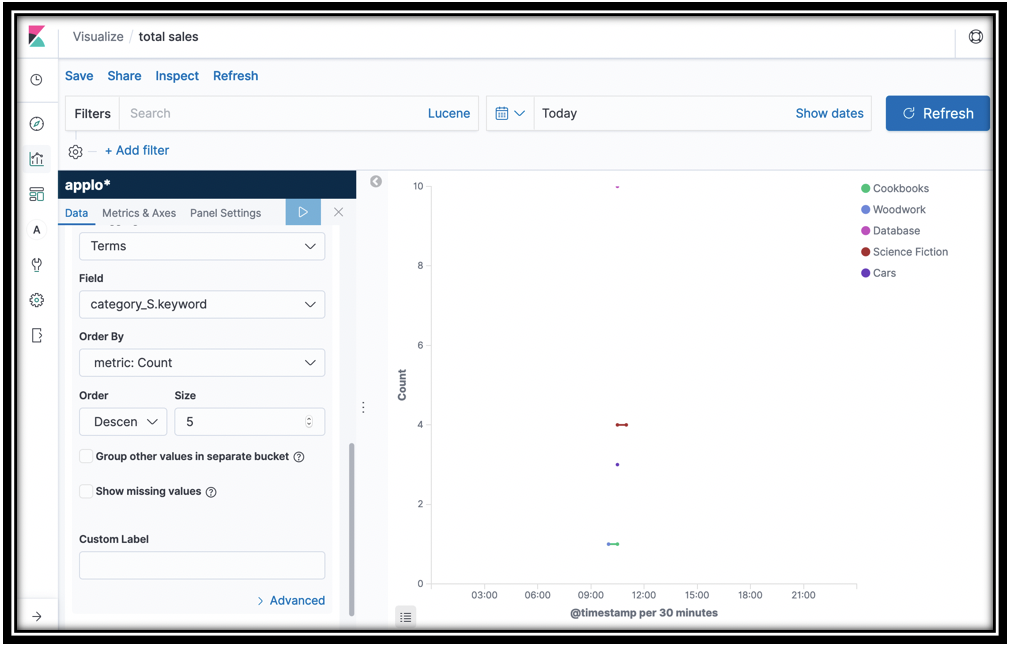
- Let’s continue with this graph to find out purchases by category
- Scroll down and click Add sub-buckets under the Buckets portion of the left navigation pane.
- Click Split Series under Select bucket type
- In the Sub aggregation menu, scroll down and click Terms
- In the Field menu, scroll down and click book_category.keyword
Click the update icon
Click Save
Click the slider to Save as a new visualization
Name the visualization sales by category
Click Confirm Save
These two line graphs show you total purchases over time, and purchases by category over time.
[Optional] What other line graphs can you build? The segments-* index contains deep data about the calls for the back end. For example, you can graph the http_response_status by aws_api_gateway_rest_api_id. You can add a filter to limit the graph to a particular aws_operation. Or you can build a line graph of aws_operation. Want to see DynamoDB only? Add a Filter name:DynamoDB. Use GET segments-*/_search in the Dev Tools panel to dig in to the fields available and get creative!
Understand your customers’ search behavior
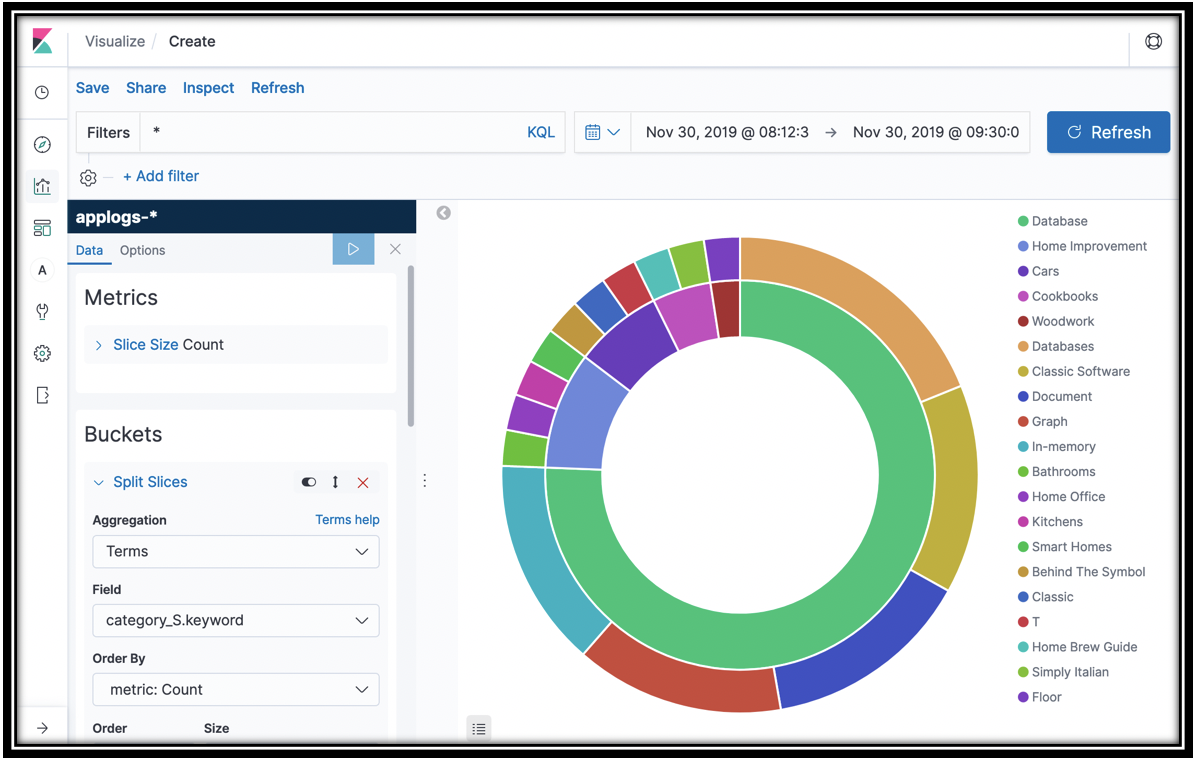
Let’s see which caegories and products are most often retrieved by customer searches. You can do this with a pie chart.
- Click the visualization icon in Kibana’s left navigation pane
- Click the “plus” icon at the top-right of the screen
- Click the Pie icon
- For Index pattern, click applogs-*
- Click Split Slices
- Select Terms from the Aggregation menu
- Select category_S.keyword
- Click the update icon
- You have the top 5 categories that appeared in search results. To subdivide, scroll down in the left navigation pane, and click Add sub-buckets
- Click Split Slices under Select buckets type
- Select Terms from the Sub Aggregation menu and name_S.keyword from the Field menu.
- Save your visualization as Search result books
You have the top 5 categories and the top 5 books in each category that customers saw in search results. You can find the source of this data in the <project name>-Search Lambda function.
[Optional] Explore the segment and summary data as well. From the summary data, chart out the function_names.keyword and sub-bucket by ResponseTimeRootCauses.Services.AccountId.keyword (second menu choice) to see which accounts (customers) are using which functions.
Build your dashboard
The visualizations that you’ve built are great for ad-hoc, root-cause diagnosis and repair. For ongoing monitoring, you collect your visualizations in a dashboard that you can monitor in real time.
- Click the
 icon
icon - Click Create new dashboard
Click Add either in the revealed dialog, or at the top-left of the screen.
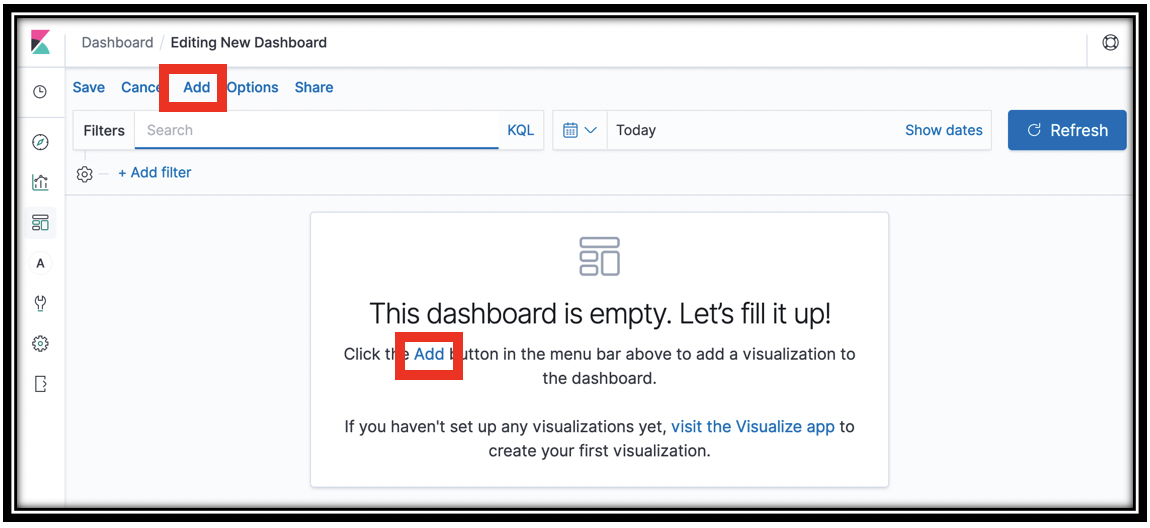
From the Add Panels slide-out drawer, click visualizations to add them
Close the drawer
You can move by dragging, and resize the visualizations
When you’re done, click Save and name your dashboard KPIs
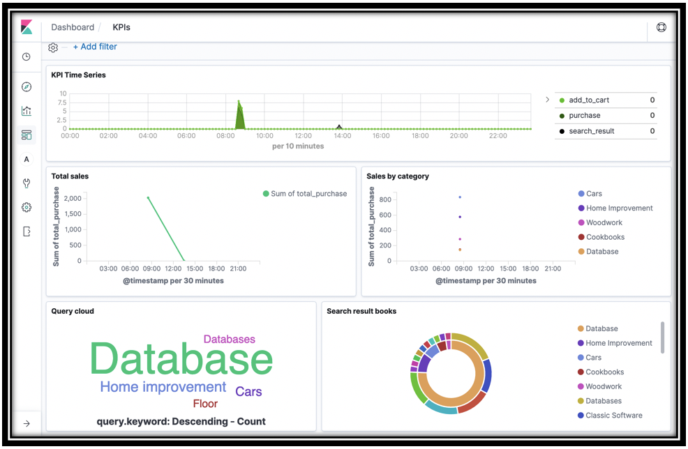
To update your dashboard in near real time, drop down the time menu
 (top-center of the screen). You use this menu to control the time frame for dashboards and visualizations across Kibana.
Under Refresh every, type
10in the text box and click StartYour dashboard will now refresh every 10 seconds with new data. Run some more searches, cart adds, and checkouts to see this.
[Optional] Set an alert
You have created a dashboard so that you can monitor what’s happening in your application in real time. In reality, you want automated monitoring with alerting based on the contents of your log data.
Amazon Elasticsearch Service Alerting is a powerful framework for setting alerts on your application data. You build a Monitor query to pull a value from your logs. You set a Trigger threshold with one or more Actions to deliver a message to a Destination like Slack, Amazon Chime, or even a custom webhook.
Follow the instructions here to set up alerting in Amazon Elasticsearch Service for your <project name>-logs, Amazon ES domain.
Add an alert for http_response_code >= 300 and get notified when your application is having issues. Or, add an alert for aggregate total_purchase < some value to get notified of a sales drop.